Irwin Allen’s beloved sci-fi classic returns!
Having continued to gain fans even 50 years after its network television debut in 1965, Lost in Space is a family saga about space exploration, charming and beloved as well as ahead of its time. The show was prematurely canceled in its third season, but writer Carey Wilber had already penned two scripts for a fourth. In cooperation with Prometheus Entertainment and the Irwin Allen estate, American Gothic Press published the unseen episodes in comic book format.
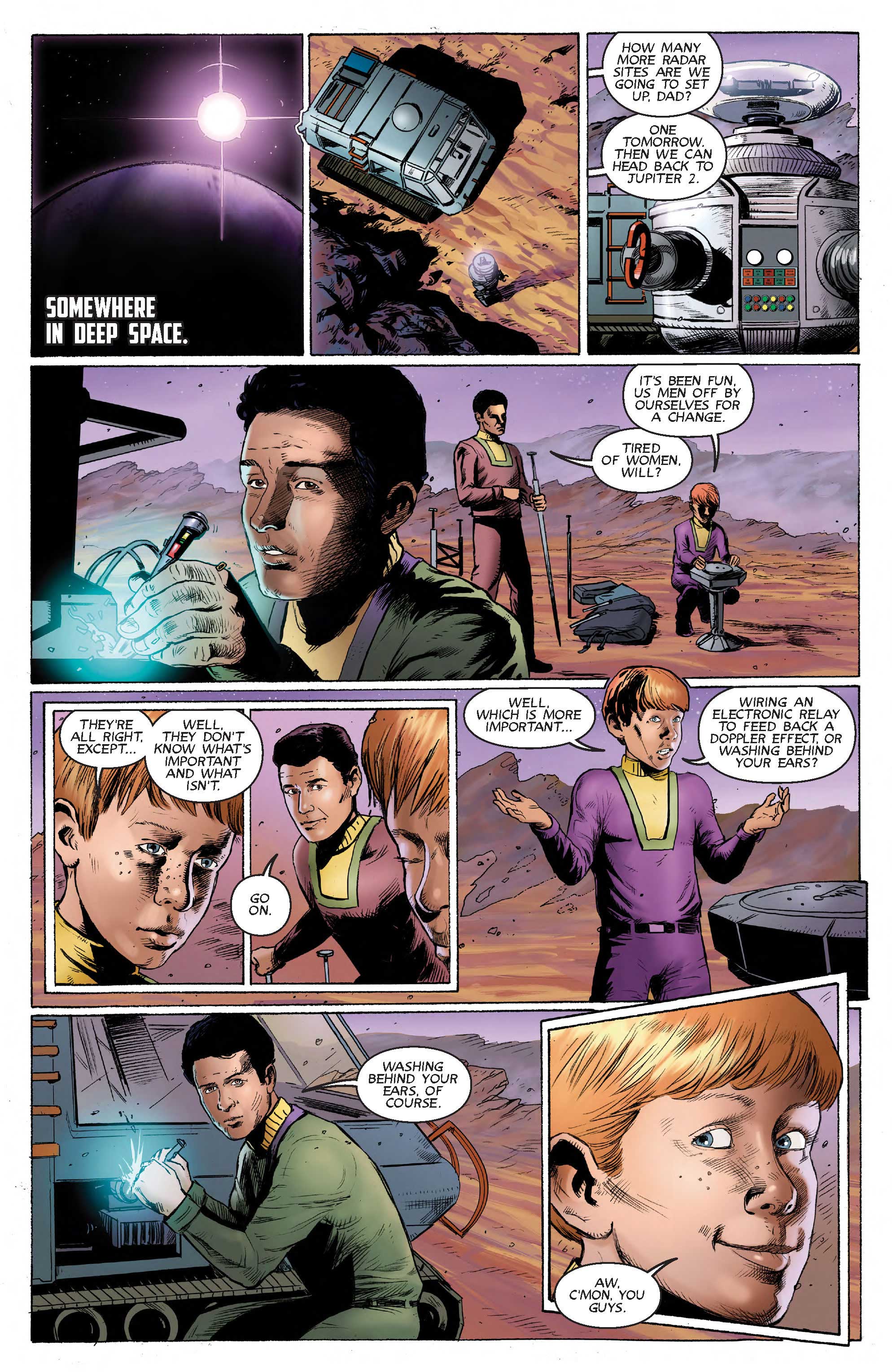
Volume 1 features “The Curious Galactics”, an episode in which the relationship between John and Will Robinson is put to the test thanks to the meddling of a couple of nosy aliens.
Full List of Credits
Based on the unproduced teleplay by CAREY WILBER
Edited and adapted by HOLLY INTERLANDI
Art by KOSTAS PANTOULAS
Colors by PATRICK MCEVOY
Letters by MARSHALL DILLON
Covers by STEVE STANLEY, RC ARADIO, and PATRICK MCEVOY
Supervising Editor, Synthesis Entertainment KEVIN BURNS
Director of Licensing, Synthesis Entertainment DEREK THIELGES
Published by AMERICAN GOTHIC PRESS © 2016
Q&A with Holly Interlandi
Q: As someone who didn’t grow up on “Lost in Space”, did you feel some pressure in adapting these stories for the life-long fans? How did you prepare for the task?
A: There was a ton of pressure. I had nightmares about die-hard fans grilling me on the most minute details of every episode. I went back and watched some of Season One, though, and discovered that a lot of classic era sci-fi has a similar feel, so the shows and films I had seen multiple times—THE TWILIGHT ZONE, THE QUATERMASS EXPERIMENT, THE DAY THE EARTH STOOD STILL—could inform my take on the LOST IN SPACE scripts. Also, good storytelling is universal, as is clear from Carey Wilber’s teleplays, and eventually I told myself that I didn’t have to be able to quote the show verbatim to know how to tell a story.
Q: How did you go about finding an artist(s) to properly illustrate such iconic characters?
A: When it comes to illustrating an existing property, character likeness is the most important. The idea is for fans to be able to pick up where the show left off, imagining the original actors in their iconic roles, and that can be difficult to do if the artist can’t capture what made the characters so likeable in the first place. I believe that the two artists we chose, Kostas Pantoulas and Patrick McEvoy, each have a style that fits their story arc very well. Kostas’s grave stoicism grounds the drama of “The Curious Galactics”, while Patrick’s whimsical lines and panel work is perfect for the psychadelia of “Malice in Wonderland”.
Q: At a couple places in the script, you included notes about updating the tools/materials the Robinsons were using. How open were Fox and Prometheus to changing details in the story?
A: I had a lot of freedom in the adaptation, but when it came to technology, we were all pretty firmly in the camp that we should stick to what they had used on the original show. An exception was the use of the force field in Issue 1, a special effect that wouldn’t have been available in the 60s; but it’s depicted in the comic exactly as written in the script, and the magic of comic books is that you don’t need special effects or a budget to bring that kind of thing to life.
Q: The second story arc, “Malice in Wonderland”, is a lot more light-hearted than “The Curious Galactics”. Was it easier to or more challenging to adapt the goofier story? Which arc did you enjoy writing more?
A: I read both scripts before deciding which to do first. It was “The Curious Galactics” that spoke to me the most, being intelligent, philosophical, and incredibly dark for an episode that would have taken place post-Season Three when the scripts were more prone to camp and silliness. I’ve always been a fan of serious and deadly adventures when lives are actually at stake and getting through the ordeal changes everyone involved.
That said, adapting “The Curious Galactics” first really made me appreciate the humor of “Malice in Wonderland”, which is light-hearted and hilarious in certain parts. The Robot in particular steals the show, unlike in “Galactics” where he’s basically a supporting observer. Best of all, the craziness of “Malice” enabled me to use the word BONK as a sound effect, which is an amazing and grievously underappreciated word. You could say that while I enjoyed doing “Galactics” more, doing that script first helped me enjoy “Malice in Wonderland” more than I would have otherwise.
Q: What were some of the biggest challenges in adapting the teleplays to comic books?
A: The most obvious thing is that when you’re working from a teleplay, there is a “camera” involved, and the characters are moving. There might be a closeup shot of someone blinking for dramatic effect. That’s not the case with comics, where you’re working with still imagery. You could put the word “blink” onto the page directly, but that’s more of a humorous device. A lot of what an adaptation involves is deciding which still images from the script would be the most effective in telling the story.
Another challenge has been dealing with how wordy Carey Wilber’s scripts are. They’re philosophical and dialogue-heavy, which is hard to do in comics because, as anyone in the industry will tell you, you run the risk of turning the story into a bunch of “talking heads”. There are techniques to avoid such issues (I tend to refer to Wally Wood’s 22 Panels That Always Work), but in an ideal scenario, the characters and action are dynamic enough that you can cut a lot of dialogue and still tell the same story. I did cut a lot of dialogue, especially in “Malice”, but I feel confident that the story has stayed intact.
LOOK INSIDE: